As a senior in college, specifically as a public relations student, you’re trying to soak up every last bit of information you can before you’re thrown into your career. You’ve spent the last four years learning about your career and everything that you should know before entering the workforce. From campaign classes to digital marketing classes. But could you name your favorite skill that you learned? For me, that would be selecting areas by color with the magic wand tool in Adobe Photoshop. Now I don’t know if you’ve ever used Photoshop before, but it truly has its perks, especially as a public relations student.
In my Public Relations Messages Style & Design class that I took as a public relations student at Auburn University, Professor Tod Meisner taught us this skill and more. We completed specific Adobe Help Tutorials, and luckily for me, I’ve worked with the Adobe Creative Cloud before. The tutorials gave me a taste of other Adobe platforms that I haven’t had the opportunity to use. However, I must say that Adobe Photoshop is still my favorite out of the bunch. You may hear that the selection tool is the most important tool that you need to master in Adobe Photoshop, and I won’t argue with that. You can’t do a lot without knowing how to select what you want to change, but the magic wand tool is a tool that can take you the distance in your projects.
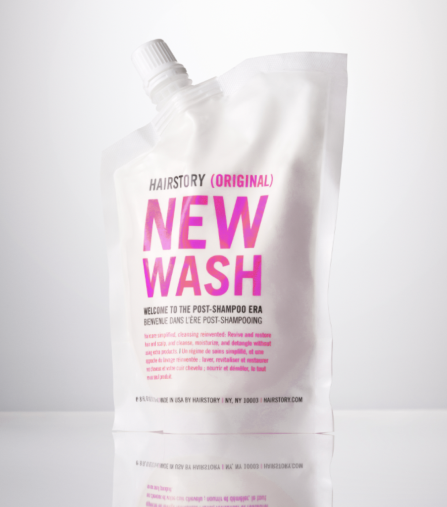
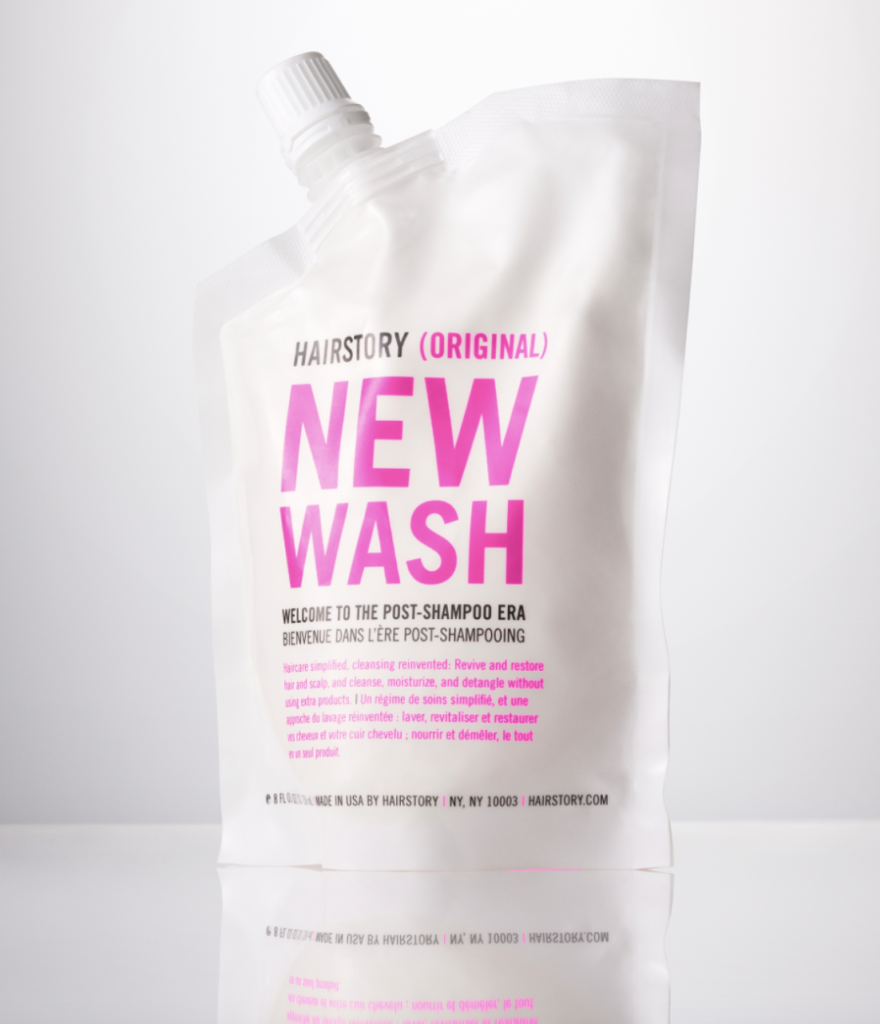
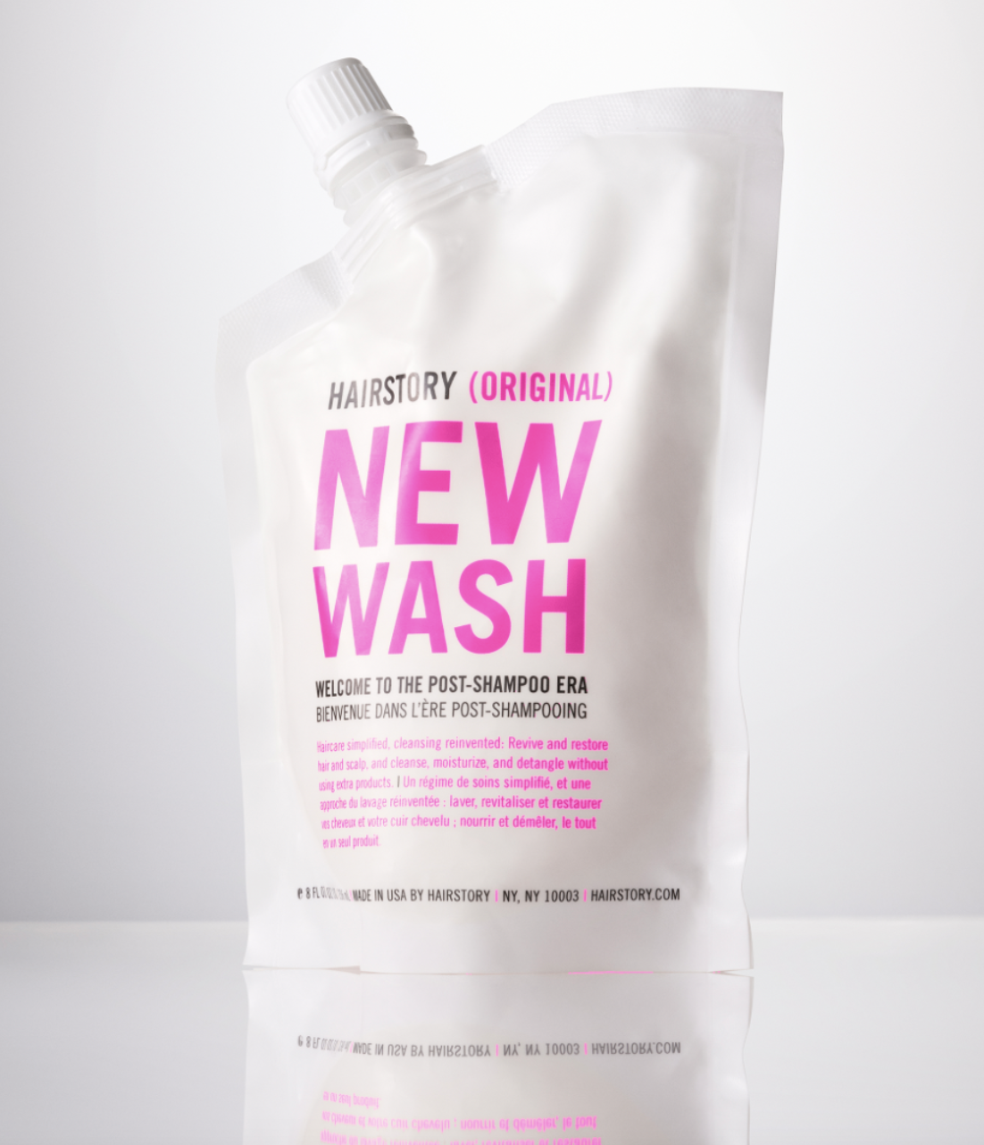
Adobe Photoshop and all Adobe platforms are essential to having a well-rounded background in design. Most job applications will have “skilled in Adobe” under their requirements, as I’ve come to realize through the job search process. But there’s a difference between learning it and adapting it to your work. For example, back when I interned at Hairstory, the Barbie Movie premier was days away and I wanted to change the colors of our packaging from orange to pink for social media. I did it in the most complicated way and had to change each letter manually because I had no clue that selecting areas by color was an option. It did not come out how I wanted it to, and some of the shading was off.


You may not see a big difference, but I promise you there is one. The shading isn’t off on the letters themselves in the “after version” and the pinks in the image now completely match each other without altering the shape of the product. It’s also giving more of a “Barbie look” which was the goal of the campaign. Selecting areas by color is absolutely essential. Here are the three steps to the skill according to Adobe Creative Cloud:
- Click on the image that you want to change with the Magic Wand Tool
- It will select areas that are similar in color and tone to the color that you picked
- If the selection doesn’t include everything that you wanted, you can adjust the Tolerance in the Options bar
- While in the Options bar, leave Contingous checked if you only want adjacent areas of similar color. Uncheck the Continguous button if you want nonadjacent colors selected as well.
Don’t be nervous public relations students! I can sit here and type out the steps for you all I want, but Adobe offers tutorials for everything you need. You can find the selecting areas by color tutorial here. This skill will continue to benefit social media campaigns in your future career endeavors as well as mine. As a public relations student, it makes editing colors within a picture easier than selecting each area separately. Make the magic wand tool YOUR superpower!

